Catalogue Wizard
What the Catalogue Wizard does
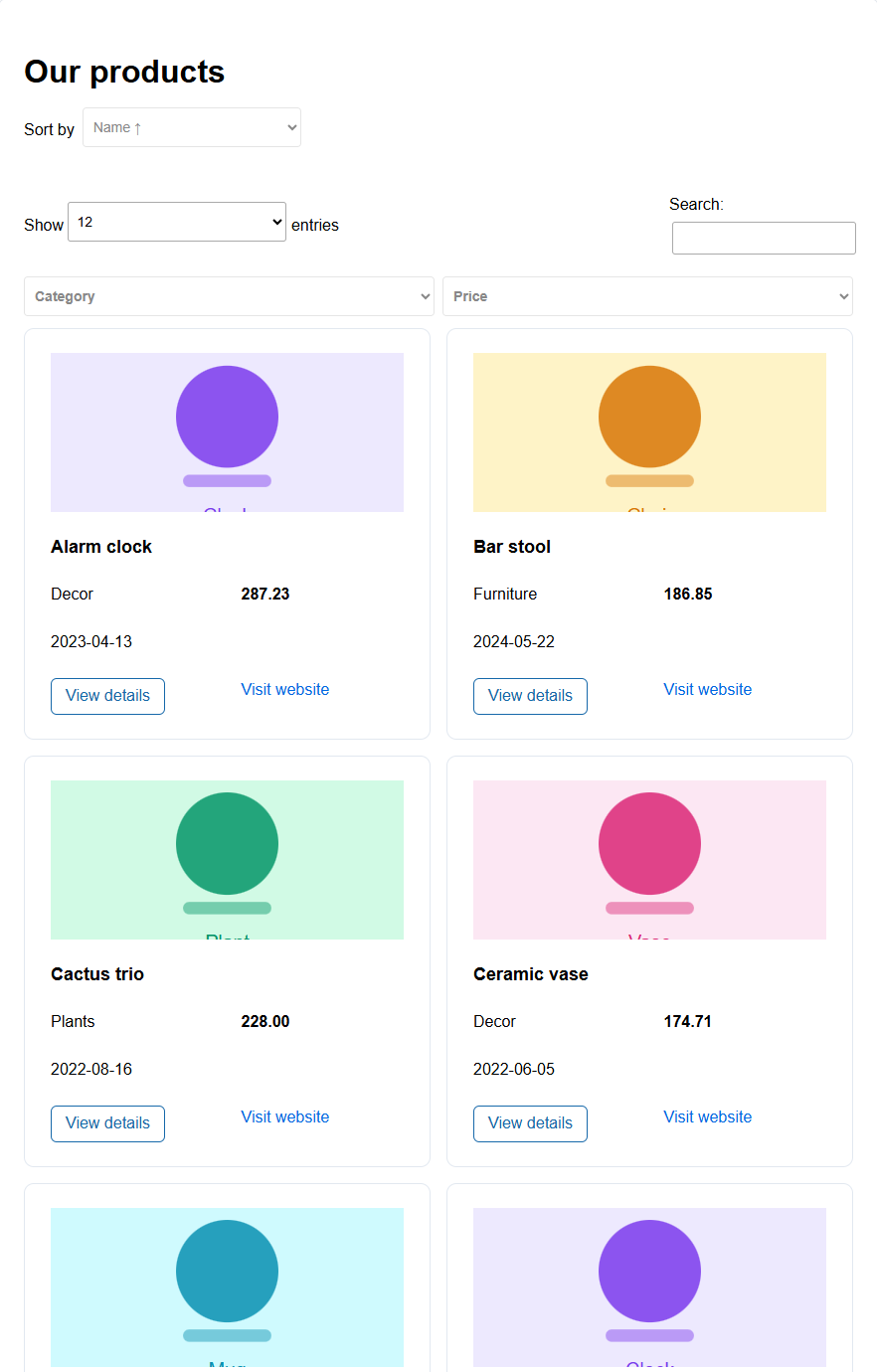
This wizard turns a list of records into a catalogue that visitors can browse. Products, equipment for hire, courses, properties, members, publications: anything with one row per item. Each record is shown as a card or as a table row, visitors search, filter, sort and page through the list, and a View details button opens any record in a popup.
You design the catalogue in five steps, with a few sample records. The result is an ordinary Tabulizer table ruleset: it works with your real data in a table or a data source, and with the data source cache and server-side processing it handles thousands of records.

The live preview
From step 3 on, the Live Preview under the steps shows the catalogue built from your sample records. It is not a picture: Tabulizer renders it exactly as it will render the saved ruleset, so you can search, filter, sort, change page and open the details popup in it.
- Width switches between Desktop, Tablet and Mobile, to check how the cards rearrange on smaller screens.
- Refresh rebuilds the preview by hand, if you ever need to.
The preview uses up to 200 sample records.
Step 1 — Layout and data
Select a layout
| Layout | Use it for |
|---|---|
| Cards | Each record is a card in a grid: a product, a member, a property. Best with images. |
| Table rows | Each record is a row of a list, with its fields side by side. Best for many records with few fields. On phones the rows stack, each value under its label. |
Sample data
The wizard designs the catalogue around sample records. Their column names become the elements you place on the card in step 3. Your real records come later, from your own site. There are three ways to get a sample:
| Choice | What it does |
|---|---|
| Use random data | A small product list with names, categories, prices, dates, images and links, to try the wizard with. |
| Type sample data | Paste records from a spreadsheet or a CSV file. The first line holds the column names; each further line is a record. Set the Column separator (comma, semicolon, tab, pipe, caret or asterisk) and the Text enclosure (double quotes or none) to match. |
| Grab data from a website | Reads an HTML table from a public page, once, as sample data. Enter the Web page address, pick the table by its number on the page (1 for the first) or by an attribute and its value, and press Grab table. |
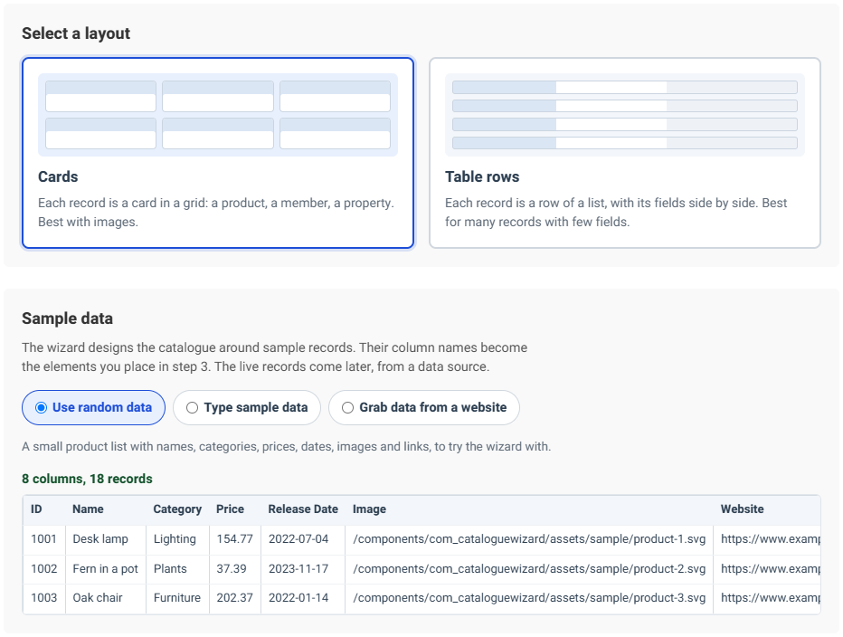
Make the sample look like your real data. Use the same columns, in the same order, with typical values. The wizard looks at the values to pick each column's format: numbers, prices with a currency sign, dates, web addresses, email addresses and image paths are recognised for you.
Step 2 — Title and grid
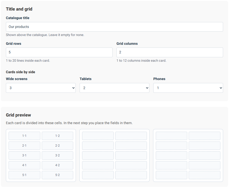
The Catalogue title is shown above the catalogue; leave it empty for none.
Then divide each card into a grid of cells. The fields go into these cells in the next step.
| Setting | What it does |
|---|---|
| Grid rows | 1 to 20 lines inside each card. |
| Grid columns | 1 to 12 columns inside each card. |
| Cards side by side | How many cards share a line on wide screens, tablets and phones. |
With the Table rows layout each record is a single line, so you only set the Number of columns (1 to 12). Fields you leave out still appear in the details popup.
Step 3 — Design
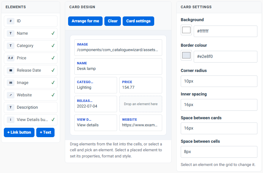
Step 3 is a small page builder. On the left, Elements lists one element for each column of your sample, plus a View Details button. The two buttons under the list add a Link button or a Text that is the same on every card, such as “Free delivery”. On the right, the Card design shows the grid from step 2.
- Drag an element into a cell, or select an empty cell and pick the element for it.
- Drag a placed element onto another cell to move it; dropping it on another placed element swaps the two. An element dragged from the list onto an occupied cell replaces what was there.
- Wider and Narrower let an element span several columns of its row, for a title or an image across the whole card. Remove takes it off the card.
- Arrange for me places the image at the top, then the record title, the other fields, and the buttons at the bottom. The wizard does this for you the first time step 3 opens, so you never start from an empty card. Clear empties the grid.
Card settings (the button above the grid, or the right-hand panel when nothing is selected) set the background, border colour, corner radius, inner spacing, the space between cards and the space between cells. With table rows, Row settings set the line between rows instead.
Select a placed element to change it. Its settings are in three tabs.
Properties
| Setting | What it does |
|---|---|
| Label, Show the label, Label position | The name shown with the value, above it or next to it. In the table layout the label heads the column, and Show the label beside the value on phones repeats it in the stacked rows. |
| HTML tag | h2–h4 for headings, strong and em for emphasis. The record title is an h3 on cards. |
| CSS class | Optional, for your own styles. |
| Record identity | Unique identifier marks the column that tells records apart, such as a product code. Record title marks the column that heads the details popup. One column may be both. The wizard guesses both from the column names; the catalogue cannot be saved without them. |
| Column width | Table rows only: the width of this column. |
Buttons have their Button text and an Appearance: filled button, outlined button or text link. A link button takes its Address from a column of each record or uses a fixed address, can Add parameter with the value of a column (for example a booking page that needs the product code), and can Open in a new tab.
Format
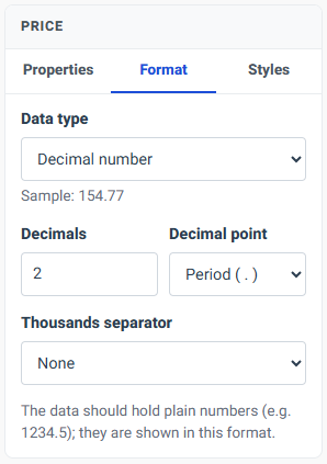
The Data type decides how a column's values are shown. Under it, the tab shows the sample's first value for comparison.
| Data type | Settings |
|---|---|
| Text | Letter case: as in the data, first letter capital, or each word capital. |
| Whole number, Decimal number, Currency amount | Thousands separator, decimals, decimal point, and for amounts the currency sign before or after the amount. The data should hold plain numbers, such as 1234.5. |
| Date | Show dates as: keep them as in the data, or pick one of fifteen formats, from 21/10/2009 to Wednesday, Oct 21, 2009. |
| Web address (URL) | Show as a link, with your own link text. A Base address for relative links turns addresses like /products/12 into full ones. |
| Image | Show the image rather than its address, with an optional base address, a width and height (or minimum and maximum sizes), whether the image is shown whole or crops to fill its box, and the column whose value becomes its alternative text for screen readers. |
| Email address | Make it a mail link. |
Styles
Text colour, background, font size, weight, style and family, alignment, letter case, padding, margin, border and corner radius. All are optional: empty fields keep your site's styles. Sizes accept px, em, rem or %.
Custom code
For what the settings cannot do, open Custom code below the design. It is closed until you open it; its heading shows how many of its boxes are in use.
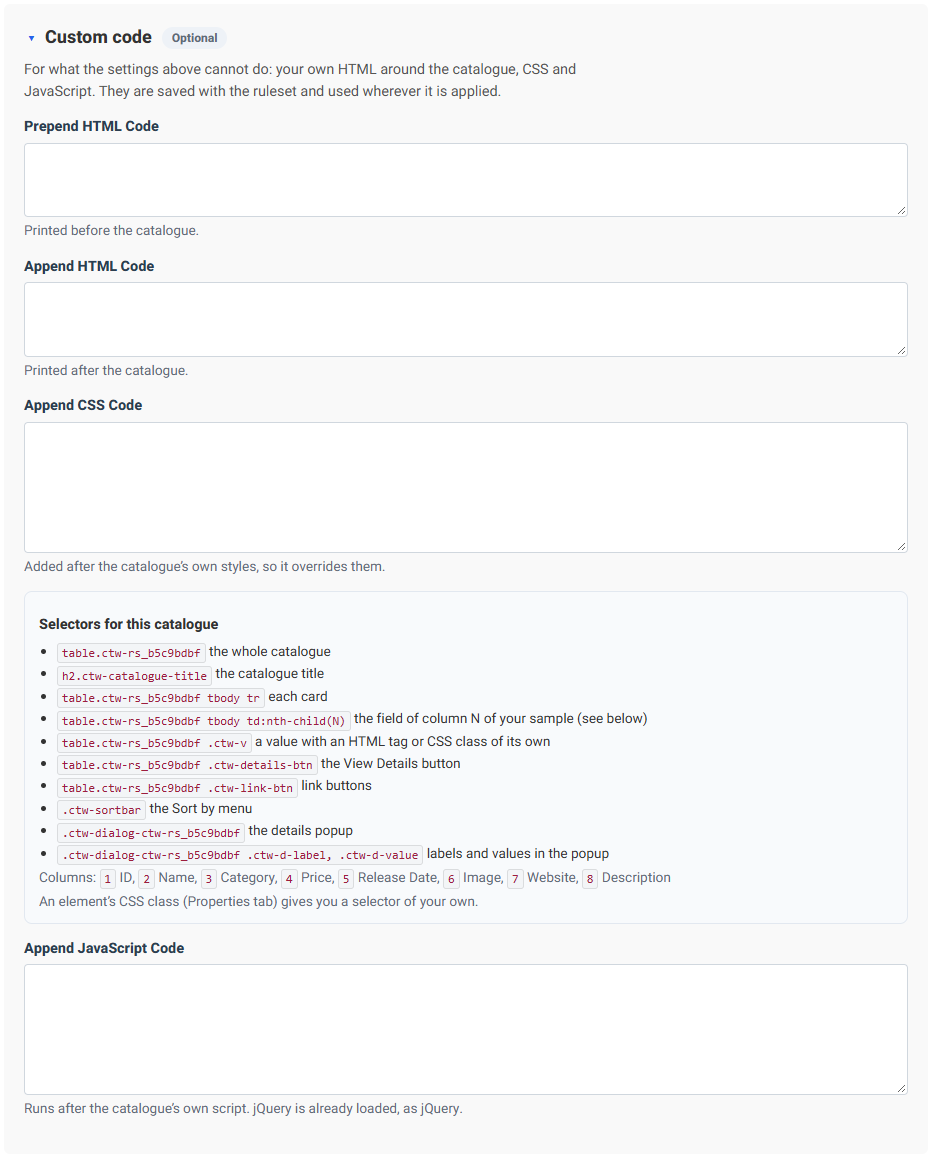
| Box | What it does |
|---|---|
| Prepend HTML Code | HTML printed before the catalogue, such as an introduction or a notice. |
| Append HTML Code | HTML printed after it. |
| Append CSS Code | Your own styles, added after the catalogue's, so they override them. Under the box, the wizard lists the selectors of this catalogue: the catalogue itself, each card or row, the field of each sample column (td:nth-child(N)), the buttons, the Sort by menu and the details popup. |
| Append JavaScript Code | Your own script, run after the catalogue's. For jQuery, write jtQuery: Tabulizer always loads it, while jQuery itself may not be on the page. |
All four are saved with the ruleset and used wherever it is applied. The live preview runs them too, so you see the result as you type; a JavaScript error is shown under the preview.
Give an element a CSS class on its Properties tab to style it by a name of your own, such as .price-tag.
The preview runs your JavaScript in a sealed-off frame: it cannot see your tabulizer.com account. The Preview in the Ruleset Manager shows the catalogue with your CSS but leaves out the custom HTML and JavaScript; both run in the wizard's preview and on your own site.
Step 4 — Details and browsing
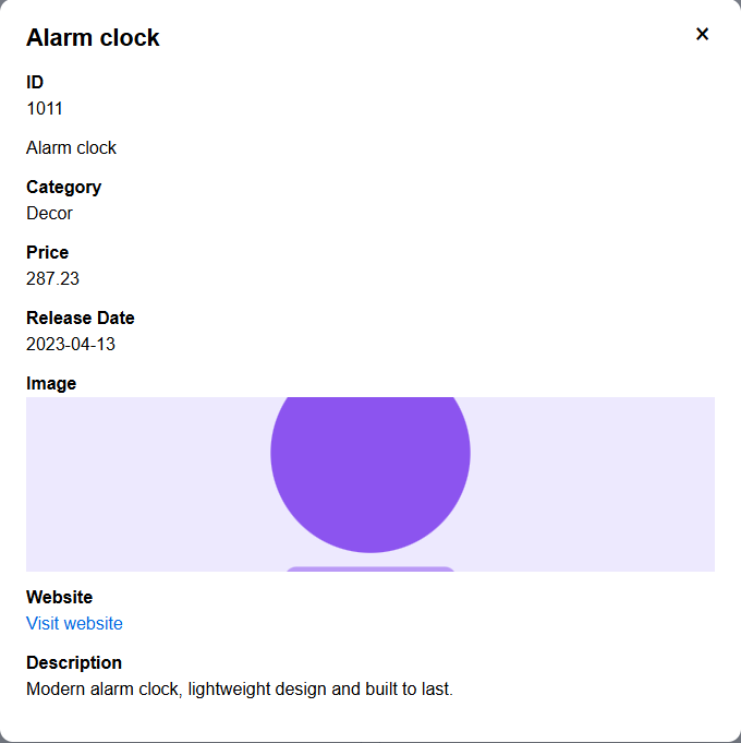
Details view
Show a details popup adds the View details button. The table below it lists every column: tick Show for the fields the popup lists under the record title, and Label to show their names, above or next to the value. Label style and Value style set the colour, size and weight of each.
Search and filters
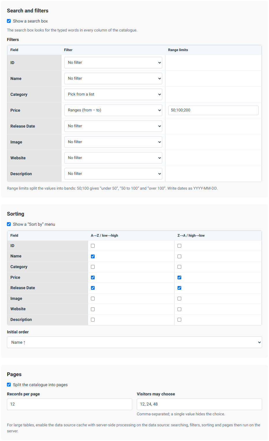
Show a search box adds a search box that looks for the typed words in every column. Under Filters, each column can have its own:
| Filter | Use it for |
|---|---|
| Text box (partial match) | Names and descriptions: typing “lamp” finds “Desk lamp”. |
| Pick from a list | Columns with a few repeated values, such as a category. The list is made from the data. |
| Ranges (from – to) | Numbers, amounts and dates. The Range limits split the values into bands: 50;100 gives “under 50”, “50 to 100” and “over 100”. Write dates as YYYY-MM-DD. |
The wizard suggests a list filter for text columns with a few repeated values.
Sorting
With cards, Show a “Sort by” menu adds a menu above the catalogue; tick the columns and directions it offers. With table rows, Let visitors sort by clicking the column headings does the same job. Initial order sets the order the catalogue opens in.
Pages
Split the catalogue into pages, with the number of Records per page. Visitors may choose takes a comma-separated list of page sizes, such as 12, 24, 48; a single value hides the choice.
Step 5 — Save
Check the preview one last time, at each width. Then enter a Ruleset title and a Description; both are required. Help is optional: notes for whoever applies the ruleset, such as which columns it expects.
Press Save & Download Ruleset. The catalogue is saved in your Ruleset Manager, where you can Preview it, Download it, Edit it in the wizard again, Edit as Copy to start a variant, or Export as DS to download it as a data source together with the sample data.
Previous Step goes back without losing anything. Start Over clears the wizard and begins again; rulesets you have already saved are not affected.
Using the catalogue on your own site
Import the downloaded ruleset into Tabulizer on your site, as you would any other ruleset, and apply it to a table or a data source that holds your records.
Keep the columns in the sample's order. The ruleset finds each field by its position: the third column of your data is shown wherever you placed the sample's third column. Your table or data source needs the same columns in the same order, with a header row on top. The header texts themselves can differ.
- Export as DS is the quickest start: it gives you a data source that already uses the ruleset, with the sample records in it. Import it and replace the sample with your own data.
- For a large catalogue, turn on the data source cache with server-side processing in the data source. Search, filters, sorting and pages then run on the server, so the page only ever loads one page of records.
- The ruleset brings its own CSS and a small script; both are installed with the ruleset. Nothing else needs to be set up.
Safe Mode and the catalogue's script. Tabulizer's Safe Mode, on by default, refuses script files inside an imported archive, and a catalogue carries one. When you import the ruleset or the exported data source, tick YES, overwrite safemode settings on the import form. It applies to that one import only.
Tips and troubleshooting
The import says the js file is not allowed
Safe Mode is refusing the catalogue's script. Import again with YES, overwrite safemode settings ticked.
Images show as addresses, or the page stops with "WebAssetManager is locked"
The catalogue was saved before 12 November 2026. Open it with Edit in your Ruleset Manager, save it again and import the new download over the old one. A Tabulizer update released after that date fixes both as well.
The wizard will not go past step 3
A catalogue needs at least one element on the grid, a unique identifier and a record title. Select a placed field and mark them on its Properties tab. A link button also needs an address.
Prices or dates sort in the wrong order
The column's data type is Text, so 100 sorts before 25. Set it to a number, currency amount or date on the Format tab.
Numbers show the wrong decimal point
The data should hold plain numbers such as 1234.5. Set the decimal point and thousands separator you want to show on the Format tab; the data itself stays as it is.
The wrong field appears in a cell
The columns of your data are in a different order from the sample. Reorder them, or edit the ruleset with a sample in your data's order.
Images do not appear
Image paths relative to another site, such as images/a.jpg, need a base address on the image's Format tab.
Related articles
- Calculator Wizard
- Contact Form Wizard
- Gallery Wizard
- Pricing Tables Wizard
- Importing a ruleset into Tabulizer